
Matthew Leitch, educator, consultant, researcher
Real Economics and sustainability
Psychology and science generally
OTHER MATERIALWorking In Uncertainty
Diagrams for controls work
First published 31 October 2003.
Contents |
Why diagrams matter
It's possible to evaluate or design internal controls without properly understanding how the underlying process and systems work, but it is not a reliable approach. You can use Internal Control Questions (ICQs) or just go with the issues interviewees raise with you, but the danger is that you will misjudge risk levels because the process and systems don't work the way you imagine or the ICQs assume. For example, it may be that getting data from a billing system to the nominal ledger is not the single step you imagine, but instead the data passes through two other databases and a spreadsheet before it hits the nominal ledger. Unless you know you can miss potential problems on that pathway.
Assuming you decide that a description of systems and processes is needed, there are ways to do it without diagrams, some of them excellent though they usually need skill to create and to read. However, most people prefer diagrams, so diagrams it is.
Common problems
Unfortunately, many diagrams turn out to be less useful than they should be. If you're running a project that involves several people or teams producing diagrams to support an evaluation of internal controls you may recognise some of these common issues:
Clarity. Diagrams are often hard to follow. ‘Oh, it's meant to be read with this narrative’ the author will say. Why? Often the diagram and narrative together still fail to record key information clearly. In a year's time the diagram will be of little use because, to understand it, you need to know already what it is trying to say, and by then people have forgotten.
Usefulness. Diagramming can take a long time, but the diagrams don't always turn out to be as useful as expected. It's nice to be able to see the systems, but the diagram should do more than give a warm feeling of familiarity. Excessive detail is another common problem.
Consistency. Make sure everyone is using the same drawing software, the same icons, and the same style of diagramming and you will still find an amazing variety of layouts and interpretations of words like ‘process’ and ‘system’. Different people will have drawn different aspects of the topic, to different levels of detail.
The following sections suggest methods of minimising all these problems. (Incidentally, if you want to master the skill of drawing diagrams like this you should consider engaging me for some individual technical tutoring or teletutoring sessions. This is the quick and easy way to do it thoroughly.)
Clarity
Whatever style of diagram you choose there are certain simple guidelines that help improve clarity. Here are some common faults that make diagrams unclear, and recommendations for avoiding them.
‘Conceptual’ diagrams. In an effort to make an explanation easier people sometimes draw something that is not true. ‘It's sort of like layers of an onion.’ they might say, when it isn't quite the same. ‘Think of it this way’ is another phrase that signals an explanation that is not going to be accurate. There is a big difference between a diagram that hides detail while still being true, and one that simplifies incorrectly.
Names but not explanations. Computer applications have names, usually acronyms, and it is often these that appear in boxes on a diagram, without explanation. Similarly arrows often lack any kind of explanation, or have unhelpful notes on them such as a picture of a floppy disk to show you the data is carried on a floppy disk. But what data? It is hard to review this kind of diagram for completeness or correctness.
Unexplained notation. I've seen all the following done without explanation: outlines around groups of boxes, boxes divided by dashed lines (perhaps with an arrow ending on the dashed line to deepen the mystery), arrows that are different styles, and different shading or box outlines.
Tangled layout. Often there is a natural start and end to something but it is hard to see on the diagram where the start and end points are. The diagrams wind around to get as much as possible on the page.
Page joining. If there's too much to go on one page a common solution is to put numbers on lines that go to the edge of one sheet of paper so that they can be matched up with lines on another piece of paper. It's fine to do this occasionally but very hard to follow and there is usually a better way.
Solution: Encourage people to base their diagrams on reality and do not accept conceptual fudges. For example, if doing a data flow diagram it may be helpful to identify process boxes with computer applications.
Solution: Insist that every box and every line has an explanation on it written in just a few words with the minimum of jargon. For a process the explanation should say what is happening in the process. For a data flow the explanation should say what data is flowing. For example, a computer system called GLADYS that creates purchase orders could have the text ‘GLADYS (create purchase orders)’. Now, anyone reviewing the diagram knows to expect to see purchase orders coming out of it, and probably requisitions and various types of reference data going in.
Solution: Don't make up notation without a very good reason and provide a key.
Solution: Move from start to finish in the same general direction, such as left to right, or top to bottom. One approach is to put transaction data going in one direction with reference data coming in at roughly 90 degrees to it.
Solution: There are two good alternatives. The first is ‘levelling’ i.e. putting the diagram onto more than one level of detail. Each box at the top level can, potentially be exploded into a diagram at a lower level. In some drawing tools you can set up hot links so that this is done with a click on the icon. The second technique is to separate the information you want to show on the basis of the events that trigger the processes you are showing. For example, you could do a picture to show what happens for new sales, and another for sales returns. Usually it is possible to keep the basic layout but change the arrows and explanations.
To show the effect of improving clarity, here's a makeover. Click on ‘Before’ and spend a few seconds trying to work out what is going on, then close it and click on ‘After’. It should be much easier to see what is happening, so spend a few more moments thinking about what might be missing from this diagram. Creating diagrams that are clear enough to be reviewed for gaps and anomalies is vital.
| Before | After |
|---|---|
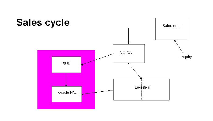 |
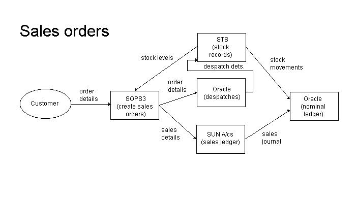 |
Usefulness
The last thing you want is for people to spend weeks on diagrams and have nothing useful from them until all the work is finished. Fortunately, it is easy to break the work into incremental deliveries, allowing you to learn from what has been done and to stop the work once you decide there's not much to be gained from going further.
The first goal should be to produce pictures of the underlying task, free of the details of any controls that may be involved. For example, if the data on a paper document has to be input to a computer system that is what you show, ignoring details of how it gets sent around departments gathering authorising signatures before the input takes place.
Besides being much quicker to do there are two other reasons for doing this:
It is much easier to understand what is happening if you look at the underlying task first. Often it is very simple.
A key stage in controls work is to link risks with controls. The underlying task is the thing that has risks. The controls are what are added to try to make sure the underlying task goes correctly. Until you isolate the underlying task this analysis is not possible.
Next, make a list of the events that the process responds to (e.g. a new sale, receipt of cash, receipt of credit note) and start with the ones that diagramming will be most useful for. These will usually be the high volume events, but remember that there are also low volume reference data updates such as changes to sales tax rates that can be extremely important.
Another way to divide diagramming into incremental deliveries is to add layers of detail in stages. For most review work this is not necessary as detailed diagramming is not needed at all. However, for some design work you might want to do more detail and that can be done as a separate delivery once higher level pictures have been done and shared with others who can use them.
Diagrams should directly support later stages in your work. That may involve some careful thinking about the task and what you need from diagrams.
In ‘The easiest and best matrices for documenting internal controls’ I explain one method of risk identification that is useful when your main interest is ensuring that information is processed reliably. In this technique the processing is sliced into steps, each one being (a) across a process, or (b) across a dataflow (including data capture and data output flows). For each step you then look for controls covering completeness, accuracy, validity, and any other control objective of interest. Obviously, a diagram in terms of processes and dataflows makes this easy.
It helps to ensure accuracy and usefulness if you try to base your diagrams in physical reality. Look for computer applications, databases, computers, paper forms, and reports. Find where data resides and where it moves and show those stages.
Consistency
Let's imagine you've laid down rules for clarity, rules for icon styles, the diagramming style, and what software to use. You've agreed with everyone that the first stage is to document the underlying task. What can go wrong? Usually it's interpretation and level of detail. Ask people for a ‘process description’ and be amazed at how many interpretations of ‘process’ there are.
Here are three ideas for consistency:
Provide an example. If you don't have one perhaps you can make sure at least one member of your team finishes something decent quickly so you can send it to everyone else as a guide.
Lay down some rules. State what sort of thing will typically be a process, flow, data store, decision, or whatever. I usually let each computer application be a process, but there are exceptions such as when an application is distributed over more than one computer, or where an application is very large and modular.
Base your rules on physical reality. Problems occur when processes become ‘conceptual’.
Conclusion
Looking back at the many diagrams I've seen over the last decade only a handful have been clear and useful. The vast majority have been seriously flawed in one way or another and that means effort was wasted. This is not necessary and the rules of clarity suggested above should help.
Many companies do not have diagrams on the grounds that it would be too much work, but using the ideas described above to control the level of detail should make it much more cost effective.
Made in England