
Matthew Leitch, educator, consultant, researcher
Real Economics and sustainability
Psychology and science generally
OTHER MATERIALWorking In Uncertainty
Favourite ways to characterise risks
by Matthew Leitch, first published 21 June 2007.
Contents |
Thank you
First, thank you to everyone who responded to this survey, particularly if you weren't familiar with characterising risks using probabilities and other numbers, and so had to think carefully to get through the survey.
Summary
The survey probed differences between people in how they like to be given information about risks, how they like to give information about risks, and what they prefer overall and why. This is relevant to anyone who has to think about uncertain quantities in any context, not just to professional risk managers. For example, a student might speculate about her chances of getting different degree results for different levels of hard work. An IT manager faced with a choice between alternative network designs might want to ask searching questions about uncertainties around their cost and reliability. A budget holder might want to explain how different levels of funding might affect his chances of achieving other performance targets. A clear, logical approach can make all these situations easier to deal with, but which approach should it be?
The survey asked people to choose between working with exact numbers and working with words like ‘High’ and ‘Medium.’ It also offered a choice of styles.
One style was a version of the probability-impact matrices commonly suggested in guides to project and corporate risk management. In the survey this was called the ‘Average’ style because it used the probability weighted average impact of a risk given that the risk event occurred and there was at least some impact as a result.
The other two styles were variations on the ‘fixed value’ method for expressing probability distributions. Although this style is well known, widely respected, and has been extensively studied by scientists it is rarely suggested in guides to project and corporate risk management. In this study these styles were called ‘Worse Than’ styles because they involve respondents thinking about the probability of risks causing impacts that were ‘worse than’ given levels.
Some respondents were more familiar with thinking about risks than others, and this was established through the way they were recruited into the study and from a question in the survey about the respondent's background and role.
The results showed that risk ‘experts’ tended to prefer the Worse Than (i.e. fixed-value) style to the Average (i.e. probability-impact) style, and to prefer exact numbers to word categories. In contrast, less risk focused people tended to prefer the Average style to the Worse Than styles and to prefer word categories to exact numbers.
Although these preferences are easy to see, neither style was dominant in either group or overall. Although the probability-impact style is the main style suggested by most guides to corporate and project risk management (quite often the only style mentioned) it turned out that many respondents preferred the fixed-value style overall as well as using it in the tasks.
One recommendation arising from this is that risk management guides should recognise a wider range of methods, including those that do not involve separate consideration of probability and impact.
Another observation was that people who chose to use exact numbers tended to do better when making decisions in the first task. This is not surprising since the word categories were so broad that most of the options were rated the same. Despite this a substantial minority of respondents preferred to rely on words only, even though it meant they could not do the task well. It is not clear why this happened though a general dislike of numbers may have been part of the reason. Responding to this I have developed a risk rating approach based on the Worse Than styles that can be used with numbers or just with colours, and in some tasks at least it is unusually intuitive. (You can experience it by following this link.)
Yet another observation was that when asked to give judgements about a risk more people preferred the word categories to giving exact numbers and several commented on why. Firstly, it is less work for them, and secondly exact numbers seem to give an undesirable illusion of precision and knowledge. Solutions to these issues are also discussed in the report below.
Design of the survey
To understand the design of this survey you need to understand how the respondents were invited, what they had to do to complete the survey, and what techniques for characterising risks were offered to them.
Sources of respondents
To ensure a range of expertise in risk assessment among respondents they were recruited from different sources to one of two identical versions of the survey. This meant that responses could be roughly separated between the more and less risk oriented respondents. Here are the sources of respondents used:
Risk-oriented group: Recruited by invitations posted to the RISKANAL Internet discussion list, a list aimed at risk analysts that attracts high quality participants with an interest in risk, not all of whom do risk analysis in the narrow sense.
General group: Recruited primarily by invitations posted on the PMA Forum Internet discussion list, a list aimed at people interested in performance measurement which also attracts a large group of high quality participants. Some additional respondents were recruited by personal invitations to people known to me but not interested in risk specifically, and by invitations to family contacts of working age.
The flow of the survey
The survey consisted of six pages, viewed in sequence.
Page 1 asked the respondent what country they were in and what their role was, from a choice of ‘Student/academic’, ‘Internal/external audit’, ‘Risk management but not audit’, ‘Performance management’, and ‘Other’.
Page 2 gave the following explanation of a task that involved using information about risks:
‘Please imagine you are planning a week long camping holiday in a mystery country. You will be asked to decide which month to go in. To help you there are six tables you can see, each showing in a different way how weather might affect your fun month by month. You can have a look at any or all of them but then must choose one table and make your choice of months using it.’
‘There are three basic styles, ‘Average’, ‘Worse Than with 1 level’, and ‘Worse Than with 2 levels’, and you can choose to work with scales that are exact numbers or use the categories ‘High’, ‘Medium’, ‘Low’. If you find any of the explanations a little confusing please do not worry. Just do your best. Confusion is part of the study.’
Page 3 presented an initial display of data, chosen at random by the survey software from the six available, and radio buttons with which to select other styles and scales. The styles available were ‘Average’, ‘Worse than with 1 level’, and ‘Worse Than with 2 levels.’ These are explained in the next subsection. As a radio button was clicked the data table selected was immediately shown on screen.
The tables of data about weather in each month were based on exactly the same set of underlying probability distributions, but each method of presentation threw away some information. Some styles and scales were more informative than others. In particular, exact numbers were far more helpful than the word categories ‘High’, ‘Medium’, ‘Low’, ‘None.’
This page was where the respondent had to select a best and second best month for their holiday.
Page 4 gave instructions for the second task, which involved giving risk ratings.
‘Now please imagine you are planning a long car journey with two other people, one of whom owns the car and will drive. The journey will take 8 to 10 hours if you stay on the best route and is through an unfamiliar country whose language none of you can speak.’
‘The driver insists on choosing who will read the maps and asks you and the other passenger to write down the risk of delay from your navigation mistakes, if any, if you do that job.’
‘On the next page you will have a choice of which style you would prefer to use to describe the risk of delays from your navigating mistakes, if any. You are keen to have a quick journey so want the right person to be navigating.’
Page 5 offered more radio buttons, again giving the choice of styles and scales. As each radio button was clicked the questions to be answered were shown. The respondent was required to complete one of these sets of questions.
Page 6 finished the survey with the questions ‘Overall, which style do you personally most like to work with?’ and ‘Why?’ Respondents had to choose a combination of style and scale from the ones used in the study. Finally, there was a text box inviting comments.
The choice of scales and styles for risk characterisation
The words used to describe each combination of style and scale were a crucial detail in this study. Care was taken to make the styles and scales comparable in every respect except the style and scale used. For example, neither was helped by information graphics and neither was complicated by elaborate justifications of subjective probabilities.
All the styles were explained to the same level of precision. This involved presenting the probability-impact style in an unusually precise way. Typically, when separate ratings of probability and impact are used, the instructions ask for something like ‘probability of occurrence’ and ‘impact if it does occur.’
A vital detail that is almost never explained is how the respondent is to give a single impact number when the impact is uncertain or could vary according to how the event has occurred. For example, the risk of fire could result in no fires at all, or one or more fires of different potential seriousness. The number to give is presumably some measure of central tendency, such as the mean impact, modal impact, or median impact.
In this survey respondents were asked to give the probability weighted average impact, which is the number mathematicians call the ‘expected impact’, and the best candidate if you then want to multiply the ‘impact’ by the probability to get an expected impact overall.
Explaining this aspect of the Average style put it on an equal footing with the Worse Than styles, where the numbers were also fully defined.
The number of data required for each style was also important. The Average style required two data per risk, as did the Worse Than with 1 level. However, the Worse Than with 2 levels required three data, putting it at a disadvantage.
The words used to ask for ratings in the second task were similar to those in the first task and were as follows:
Average style with Category scale: (A) ‘What is the probability that at least some time will be lost due to navigating mistakes?’ (None/Low/Medium/High) (B) ‘What is the probability weighted AVERAGE loss of time IF at least some time is lost due to navigating mistakes? (This should consider very low levels of lost time, very high levels, and everything in between, but weighted according to how likely each amount of lost time is.)’ (None/Low/Medium/High)
Average style with Number scale: (A) ‘What is the probability that at least some time will be lost due to navigating mistakes? (Give a number between 0 and 1, inclusive.)’ (B) ‘What is the probability weighted AVERAGE loss of time in minutes IF at least some time is lost due to navigating mistakes? (This should consider very low levels of lost time, very high levels, and everything in between, but weighted according to how likely each amount of lost time is.)’
Worse than style with 2 levels with Category scale: (A) ‘What is the probability that at least some time will be lost due to navigating mistakes?’ (None/Low/Medium/High) (B) ‘What is the probability that AT LEAST a Medium amount of time will be lost due to navigating mistakes?’ (None/Low/Medium/High) (C) ‘What is the probability that AT LEAST a High amount of time will be lost due to navigating mistakes?’ (None/Low/Medium/High)
Worse than style with 2 levels with Number scale: (A) ‘What is the probability that at least some time will be lost due to navigating mistakes? (Give a number between 0 and 1, inclusive.)’ (B) ‘What is the probability that MORE THAN 20 minutes will be lost due to navigating mistakes? (Give a number between 0 and 1, inclusive.)’ (C) ‘What is the probability that MORE THAN 120 minutes will be lost due to navigating mistakes? (Give a number between 0 and 1, inclusive.)’
Worse than style with 1 level with Category scale: Identical to questions (A) and (B) of the Worse Than style with 2 levels with Category scale.
Worse than style with 1 level with Number scale: Identical to questions (A) and (B) of the Worse Than style with 2 levels with Number scale.
Survey respondents
The Risk-oriented group contained 64 volunteers, mainly from the USA. The General group contained 50 volunteers, mainly from the UK.
The mix of roles was different between the two groups:
| Risk-oriented group | General group | ||||||||||||||||||||
|---|---|---|---|---|---|---|---|---|---|---|---|---|---|---|---|---|---|---|---|---|---|
|
|
In summary, the Risk-oriented group contained more risk managers and students/academics, while the General group contained more performance managers.
Preferences and reasons
The following graph shows the number of respondents making various choices in the Risk-oriented group for each combination of style and scale (abbreviated in an obvious way e.g. ‘ave_cat’ means the Average style with Categories):
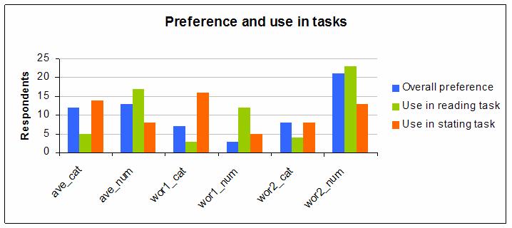
Their preferences for use in the first and second task, and overall are quite spread across the six possibilities and there is some variation between tasks.
Overall, a majority preferred to use one of the Worse Than styles and also a majority preferred to use exact numbers rather than categories
In particular, the most preferred combination was the Worse Than style with 2 levels and using exact numbers.
The next graph shows the same information but for the General group of respondents:
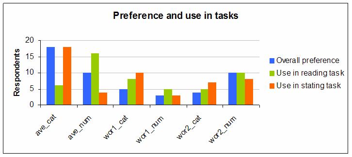
Again, preferences are quite well spread over the six possibilities, but this time a majority preferred the Average styles and also a majority preferred to use categories rather than exact numbers.
The most preferred combination was the Average style with categories.
The preferences for different styles and scales need to be interpreted cautiously. Some respondents reported that they found the study confusing and some people who started the survey did not finish and wrote to me to say they had found it too confusing. Others found it needed concentration but they could do it, and one even wrote to say he had found it easy.
It is likely that many of those who started the study but gave up would have preferred the Average style with Categories, which was a common choice among non-risk focused respondents.
On the other hand, if expertise tends to favour exact numbers and the Worse Than with 2 levels style, then perhaps if the study had been longer and given respondents more time to understand and get comfortable with all the methods more people would have preferred the expert's typical choice.
Respondents completed the whole survey in about 8 minutes on average, which isn't much time considering they had two tasks and a lot of choices to make.
The differences between groups could be due to some unknown factor, or to the fact that most Risk-oriented respondents were also from the USA while most General respondents were from the UK. However, the most likely explanations seem to be their risk expertise and/or numeracy.
People in risk management roles tended to prefer the ‘wor2_num’ combination as did Students/academics in the Risk-oriented group. Here are the figures for the Risk-oriented group:
| ave_cat | ave_num | wor1_cat | wor1_num | wor2_cat | wor2_num | Total | |
|---|---|---|---|---|---|---|---|
| Risk mgmt | 2 | 3 | 2 | 0 | 2 | 6 | 15 |
| Audit | 0 | 0 | 0 | 0 | 1 | 1 | 2 |
| Performance mgmt | 2 | 1 | 0 | 0 | 0 | 2 | 5 |
| Student/academic | 1 | 5 | 1 | 1 | 1 | 5 | 14 |
| Other | 7 | 4 | 4 | 2 | 4 | 7 | 28 |
Here are the figures for the General group:
| ave_cat | ave_num | wor1_cat | wor1_num | wor2_cat | wor2_num | Total | |
|---|---|---|---|---|---|---|---|
| Risk mgmt | 0 | 0 | 1 | 0 | 0 | 0 | 1 |
| Audit | 1 | 0 | 0 | 0 | 1 | 0 | 2 |
| Performance mgmt | 5 | 6 | 1 | 1 | 2 | 6 | 21 |
| Student/academic | 1 | 3 | 1 | 0 | 0 | 2 | 7 |
| Other | 11 | 1 | 2 | 2 | 1 | 2 | 19 |
Furthermore, in both groups preference for exact numbers also went with preference for the Worse Than styles.
| Risk-oriented group | General group | ||||||||||||||||||
|---|---|---|---|---|---|---|---|---|---|---|---|---|---|---|---|---|---|---|---|
|
|
Preferred styles and scales in the two tasks were often different. Typically, people preferred to read exact numbers but give categories. This pattern has been found in other studies too.
In this study there was another factor that may have contributed to this finding. The reading task involved probabilities concerning weather and this is one of those areas where it is easy to imagine that the numbers have a lot of data and science behind them. Exact numbers probably seem more appropriate to many people.
In contrast, when asked to judge risks from map reading errors people were nearer to guessing and for many people that means that exact numbers seem to convey an unrealistic sense of precision. One respondent explained this very clearly in his comment.
People preferred methods overall for different reasons. Here are the numbers for the Risk-oriented group, which show that exact numbers were seen as more informative while categories were seen as easier to do and more familiar, and the Average style was more familiar overall:
| ave_cat | ave_num | wor1_cat | wor1_num | wor2_cat | wor2_num | |
|---|---|---|---|---|---|---|
| Easier to understand | 30% | 22% | 29% | 40% | 27% | 27% |
| Easier to do | 27% | 7% | 24% | 20% | 33% | 11% |
| More informative | 20% | 37% | 24% | 40% | 7% | 35% |
| More familiar | 20% | 15% | 24% | 0% | 13% | 8% |
| Other | 3% | 19% | 0% | 0% | 20% | 19% |
Here are the numbers for the General group, showing that the Average style was seen as easier to understand and more familiar while words were seen as easier to do and more familiar but numbers were more informative:
| ave_cat | ave_num | wor1_cat | wor1_num | wor2_cat | wor2_num | |
|---|---|---|---|---|---|---|
| Easier to understand | 32% | 47% | 33% | 50% | 17% | 24% |
| Easier to do | 27% | 12% | 33% | 0% | 33% | 12% |
| More informative | 5% | 24% | 0% | 25% | 33% | 47% |
| More familiar | 27% | 12% | 22% | 0% | 17% | 0% |
| Other | 8% | 6% | 11% | 25% | 0% | 18% |
The problem of avoiding numbers
In the first task (choosing months for a camping holiday based on weather risks) a substantial minority of respondents (19% in the Risk-oriented group and 38% in the General group) chose to make their decision based on quantities expressed with just the words ‘High’, ‘Medium’, ‘Low’, and ‘None’. They preferred these despite the fact that most of the months were given the same ratings when these broad categories were applied, making an optimum choice a matter of guesswork.
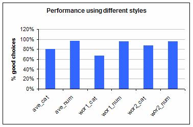
Not surprisingly those who chose categories were more likely to choose a poor month for a holiday. This was true in both groups. Here are the performance figures for the Risk-oriented group.
And here they are for the General group:
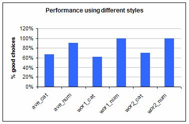
(The performance shown is the average of the percentage of answers given for the first and second best months for camping that were reasonable. Giving reasonable answers was easy because most months could be a reasonable choice given different levels of risk aversion.)
The reasons for this preference are unclear but may include a general avoidance of numbers, a desire to avoid being in a situation where a clear mistake could be made, or perhaps a desire to assert the principle of recognising that probabilities are uncertain and should be treated cautiously.
One of the reasons for preferring word categories is based on a subtle fallacy. In general conversation if we are asked to say the chance of something happening we choose a word or phrase that suggests a range of values. For example, we might say something is ‘definitely possible.’ There are many phrases we can choose from and the ranges they suggest are overlapping and have fuzzy boundaries. Each phrase, for a given context, suggests a best guess but also a spread.
This works well in allowing us to avoid suggesting unreasonable precision. However, in the word category scales in this survey (and in typical risk management practice) the words represent a small number of non-overlapping buckets. Most of the ranges a person might want to express are not on offer so the view they express is usually distorted in order to fit one of the buckets, as illustrated in this picture, which contrasts some freely-chosen phrases, with the hard buckets provided by a typical rating scale.
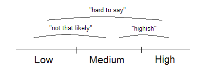
Fitting judgements into one of the buckets implies that your knowledge is exact enough to choose a category even when your best guess is near the boundary between two adjacent categories. This is not what people really want at all. The fixed ranges also distort what is being said.
Possible solutions
Since exact numbers are more informative when read and are usually preferred by more risk-focused people it is tempting to think that persuading people to use exact numbers would be a good idea, provided the problem of overstated precision can be solved in some way.
This might be done by:
taking more time to explain and give people time to get comfortable with the numerical approach;
accepting a range of numbers rather than a best guess
suggesting that people think of a range of numbers and then give the number in the middle of that range;
separately displaying the level of evidence behind the estimate;
explaining the philosophy of probabilities as subjective numbers about our ignorance rather than facts of nature;
providing a non-numerical format without broad categories that can easily be upgraded to exact numbers; or
offering a list of overlapping, fuzzy categories expressed through words and phrases that are simultaneously shown as number ranges.
‘Risk Meters’ can be shown with or without numbers. Making a set of risk judgements becomes a matter of picking a picture from a drop down list. If you would like a quick introduction to Risk Meters, to see how easy they are when used without numbers, then follow this link.
Related reading
‘Eliciting probabilities from experts’ by Steven Hora is a useful review of many techniques.
‘Risk Meters: A better way to make and show rough subjective risk ratings’ gives more information about the Risk Meters style, which is a graphic interpretation of the Worse Than style tested in the study.
Made in England