
Matthew Leitch, educator, consultant, researcher
Real Economics and sustainability
Psychology and science generally
OTHER MATERIALWorking In Uncertainty (WIU)
Bayesian recipes (2): Simple, efficient statistics for rare(ish) events
Contents |
The simple Bayesian approach to events that don't happen often lets you understand exactly what you can conclude from limited evidence, even if it's not very conclusive. And of course it's easier to understand and produces good looking graphs.
This article explains some simple techniques that can be done using Excel.
Where these techniques can be used
These techniques can be used wherever you have periods of time during which an event might happen zero times, once, twice, etc but not lots of times, and you want to understand how often the event is likely to happen in future periods of time.
With these criteria met, you then need the actual number of times the event happened (which could be zero) in one or more past time periods, sampled at random if there are more than you have data for. The sample could be selected by throwing dice, or using the the RAND() function in Excel, or just closing your eyes and dipping in.
With the techniques in this article you can enter the results from each time period, one period at a time if you like, and immediately see the impact. This allows you to stop the moment you realise you have a clear enough picture.
Learning from your sample
Before you start considering the historical data, what do you know about the pattern of occurrences? It's not going to be the same from one period to the next. If you had data from many, many past periods you could create a histogram showing how often there were zero events, one event, two events, three events, and so on. What would it look like?
It's very possible that it would look like a distribution called the Poisson distribution. The Poisson has just one parameter, which is the average number of events in a period. Here are some examples of Poisson distributions with different averages.
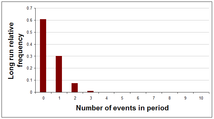
Average of 0.5 events per period.
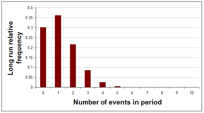
Average of 1.2 events per period.
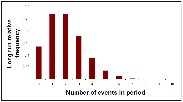
Average of 2 events per period.
If you have good reasons to think that the actual distribution, with a really large number of periods, would be one of these Poisson distributions then the real question is, what do you know about the average of this particular curve?
You might think that you've no idea about the average and that it could just as well be anywhere between zero and infinity, but is that reasonable? You think the average is quite low or you wouldn't be considering the Poisson distribution at all.
Here's a sequence of pictures showing how your view of the average of the Poisson distribution would change after each result is learned and added to the analysis. The very first curve is thinly spread out, indicating that at the start the analyst chose to have a very open mind about the average frequency. (The references to a and b will be explained later.)
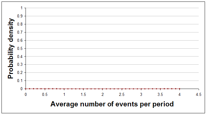
With no data so far (a=0 and b=0).
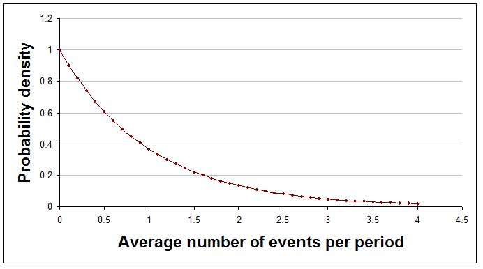
After one period, during which there was one event (a=1 and b=1).
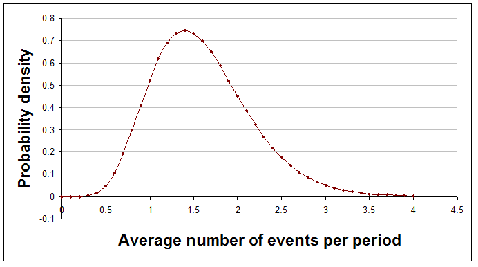
After five periods, during which there were eight events in total (a=8 and b=5).
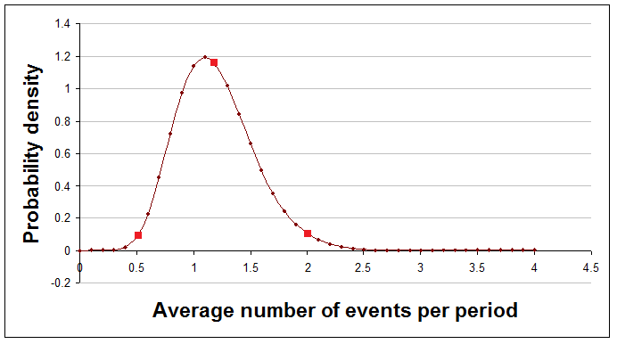
After 10 periods, during which there were 12 events in total (a=12 and b=10). In this picture the red dots correspond to the averages of the three Poisson distributions shown earlier (i.e. 0.5, 1.2, and 2). You can now see that an average of 1.2 is much more likely than 0.5 or 2.
A quick look at the curve, as it evolves, gives you a sense of where the truth probably lies, and further calculations or additional graphs can answer questions like "How likely is it that the average number of events is more than 3, given the evidence we have so far?"
The technicalities explained
Here's a quick explanation of the technicalities, with plain English translation.
| Technical terms | Explanation |
|---|---|
| The curves showing the mean of the Poisson distribution are probability density functions on the interval from zero to infinity. | A probability density function shows how likely you think each average is. Probability density functions never go negative, but they can reach high peaks. The area under the curve is always exactly 1. |
| The curves represent gamma distributions, having parameters a and b. | The gamma distribution is a mathematical formula that can describe many different shapes of curve depending on the values of two numbers used within it. These numbers are called parameters and the parameters for the gamma distribution are usually called a and b. |
| The gamma distribution is a conjugate distribution for the Poisson likelihood function. | The gamma distribution being a 'conjugate' distribution just means that the curve before and after historical results are processed remains a gamma distribution, but with modified parameter values. It is the crucial changes to the parameter values that cause the curve to change its shape. A Poisson likelihood function is just the type of the distribution of long run relative frequencies, if many periods of time were considered. |
Doing it in Excel
Processing new results
Working out the curves for the distribution of the average number of events in response to new data requires only the simplest arithmetic. However, if you want to produce graphs or answer questions about the curves then you need to use Excel functions.
Your beliefs about the average number of events each period are represented by a gamma distribution whose to parameters are a and b. At each stage a will be the initial value of a plus the total number of events seen so far, while b will be the initial value of b plus the total number of time periods considered so far. Put it another way, here's how you update a and b after some new periods have been observed:
new a = old a + events found in new periods
new b = old b + number of new periods
The very first values you use for a and b can be 0 and 0 respectively, making all averages equally likely. The relevant Excel functions can't handle these values but don't worry. As soon as you have some data things will start working as you expect.
Looking at results
Watching the gamma curve as it changes shape in response to new results is interesting and reassures you that you are doing the right thing.
To show the curves in a graph you need to make a table where the first column is average frequencies, evenly spaced, between 0 and some sensible highest number. The second column needs to be the value of the gamma curve for each average frequency. You then add a scatter graph with joining lines to that and you're done.
Excel provides a function to give the value of the gamma curve at particular points. The function is GAMMADIST(). However, this function requires as inputs a and 1/b, so if you would prefer a function that takes just a and b then you can define a new function that uses Excel's function but tweaks the inputs. It should look like this:
Function gamma_dens(x, a, b)
  gamma_dens = Application.GammaDist(x, a, 1 / b, False)
End Function
(Don't know how to add a new function to Excel? It's easy. Open the workbook you want to add the function to. Open the Visual Basic Editor using Tools > Macro > Visual Basic Editor. Add a new module to hold the function(s) using Insert > Module. Then just copy and paste in code from this web page.)
By using GAMMADIST() this way you are not doing anything wrong. This way of using the gamma distribution is just one of three common alternative ways to 'parameterise' the gamma distribution. I've picked the one that makes a and b the most meaningful and easiest to use.
If you want to graph the Poisson distribution for a particular average then use Excel's built in POISSON() function like this:
= POISSON(events, average, FALSE)
In this formula events should be the number of events whose long run relative frequency you want, and average is the average for the curve (which is the only parameter of the Poisson distribution).
To get a look at your results so far as new data are added you could show the gamma distribution and then perhaps also the Poisson distribution for the average of that curve, or perhaps for the highest point on it. Here is how you calculate each of those:
	average = a / b (i.e. events / periods)
	point with highest probability = (a - 1) / b (i.e. (events - 1) / periods)
Summarising results so far
Graphing the curve is comforting and gives you a sense of how things are developing, but to summarise the situation precisely with numbers you need Excel to do some simple calculations. Here's how to do some different types of summary number.
Comparison with a threshold
Sometimes a helpful summary of your analysis is to say how likely it is that the average frequency is above (or below) a stated threshold. (Notice that this is the average frequency, not the probability of the number of events in the next time period.) For example, you might say something like "I'm 91% confident that these events do not happen more than 3 times a period on average." or perhaps "We are 78% confident that more than 3 sales will be made each day, on average."
You can use Excel's built in function, GAMMADIST() for this, but again it requires 1/b as one its inputs, so if you would rather just enter b then define a new function as follows:
Function gamma_prob(x, a, b)
  gamma_prob = Application.GammaDist(x, a, 1 / b, True)
End Function
In the following formulae a and b are the parameters of the gamma distribution you have calculated and threshold is the threshold. Obviously you need to replace these with numbers or references in your spreadsheet.
To find the probability of the long run average being below the threshold use:
= gamma_prob(threshold, a, b)
To find the probability of the long run average being above the threshold use:
= 1 - gamma_prob(threshold, a, b)
The probability of the true rate being exactly equal to the threshold, when using the gamma distribution, is always zero.
A central region
For most values of a and b that you will encounter the gamma distribution looks like a hill with just one peak. When it has this shape it makes sense to summarise the curve by stating a range of averages that captures most of the area under the curve. This is the fat middle of the curve, rather than the thinner tails.
To find the probability that the truth lies between a lower and an upper threshold you have chosen use:
= gamma_prob(upper, a, b) - gamma_prob(lower, a, b)
An easier approach is usually to give the values for the 10th and 90th percentile of the curve (i.e. a central area that contains 80% of the probability). You can use the GAMMAINV() function, but as ever this requires 1/b so you can define your own function like this:
Function gamma_inv(r, a, b)
  gamma_inv = Application.GammaInv(r, a, 1 / b)
End Function
You can then calculate the percentiles with these formulae:
	10 percentile level = gamma_inv(0.1, a, b)
	90 percentile level = gamma_inv(0.9, a, b)
You could say, for example, something like "I am 80% confident that the true average lies between 2.1% and 5.3%."
Perhaps the most attractive summary of this type is to give the range that is the narrowest one that captures a given amount of the probability. Unfortunately, this is not possible with Excel's built in functions, though you could do it with the Solver add-in.
Numbers to bet with
Having a distribution over all possible averages is informative and helpful, especially for long term decision making and forecasting. It's much better than just having a best estimate of the true average. However, what do you do if you have to make a decision, or perhaps place a bet, on just the next period of time? For decision-making purposes it is generally better to hold on to the full distribution and use it in your decision model than to summarise into one number.
However, for some purposes a probability distribution for the next period is appropriate and useful. What you need is a probability distribution for the number of events in the next period that somehow combines all possible averages (and their associated Poisson distributions) into one curve, but weights the averages according to how likely they are.
The distribution you need is the negative binomial distribution with appropriate parameter values. To keep life simple you can define a function to do the job by copying and pasting this code into the appropriate module:
Function gamma_poisson_prob(a, b, threshold)
' gives the probability of the next period having <= threshold events in it
    If a <= 0 Or b <= 0 Or threshold < 0 Then
        gamma_poisson_prob = "Invalid input - sorry."
    Else
        threshold = Int(threshold)
        gamma_poisson_prob = 0
        For i = 0 To threshold
            gamma_poisson_prob = gamma_poisson_prob + Application.NegBinomDist(i, a, b / (1 + b))
        Next i
    End If
End Function

Function gamma_poisson_mass(a, b, events)
' gives the probability of the next period having exactly events events in it
    If a <= 0 Or b <= 0 Or events < 0 Then
        gamma_poisson_mass = "Invalid input - sorry."
    Else
        events = Int(events)
        gamma_poisson_mass = Application.NegBinomDist(events, a, b / (1 + b))
    End If
End Function
This defines two functions. Here's how to use them. If you want to know the probability of getting exactly x events in the next period, then use:
= gamma_poisson_mass(a, b, x)
If you want to know the probability of getting x events in the next period, or fewer, then use:
= gamma_poisson_prob(a, b, x)
If you want to know the probability of getting more than x events in the next period, then use:
= 1- gamma_poisson_prob(a, b, x)
Comparing distributions
Another common requirement is to compare two or more distributions of event frequencies, though there isn't a widely used statistical significance test specially for this, so the technique below is not usually a replacement for anything of that sort.
This would be appropriate if you were studying two independent processes that each produced events in periods of time. You just apply the usual gamma distribution technique described above to each of the processes to get an a and a b value for each. The resulting gamma curves might look something like this:
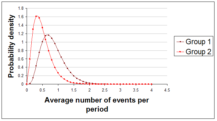
Here are examples of useful summary statements about the difference between these two curves that you might make:
"The true average of Group 1 is 78% likely to be greater than the true average of Group 2."
"There's only about 0.1% chance that Group 1's average is at least 2 per period higher than Group 2's average."
Sadly, Excel doesn't come even close to providing a function to do the comparison, but if you paste this code in as usual you can use this new function:
Function gamma_diff_prob(a1, b1, a2, b2, diff, runs)
' gives the probability that the mean of curve 1 is greater than curve 2 by at least diff
    Dim count As Long
    If a1 <= 0 Or b1 <= 0 Or a2 <= 0 Or b2 <= 0 Or runs <= 0 Then
        gamma_diff_prob = "Invalid input - sorry."
    Else
        count = 0
        For i = 1 To runs
            If Application.GammaInv(Rnd(), a1, 1 / b1) > _
Application.GammaInv(Rnd(), a2, 1 / b2) + diff Then
                count = count + 1
            End If
        Next i
        gamma_diff_prob = count / runs
    End If
End Function
With two processes giving parameters a1, b1, a2, and b2 use:
= gamma_diff_prob(a1, b1, a2, b2, diff, runs)
In this formula diff is the difference between the two averages and runs is the number of iterations used to arrive at an answer. The more iterations you use the more accurate the results, but the longer it takes. I suggest using 1,000 runs first to see what happens.
If you have more than two gamma distributions to compare then you can compare them in pairs and report your findings.
Generating random numbers
You might for some reason want to generate random numbers that conform to the gamma distribution. An Excel formula to generate a single such number every time the spreadsheet is recalculated uses the gamma_inv() function given above and is:
=gamma_inv(RAND(), a, b)
As usual, a and b are the parameters of your gamma distribution.
If you wanted to generate random numbers according to the Poisson distribution you would again be disappointed by Excel, so paste in this code to an appropriate module:
Function poisson_inv(x, lambda)
    Dim cp As Double
    If x < 0 Or x > 1 Or lambda < 0 Then
        poisson_inv = "Invalid input - sorry."
    Else
        cp = Exp(-lambda)  ' poisson prob for 0
        poisson_inv = 0
        Do While x > cp
            poisson_inv = poisson_inv + 1
            cp = cp + lambda ^ poisson_inv / Application.Fact(poisson_inv) * Exp(-lambda)
        Loop
    End If
End Function
You can now generate a new random number each time the spreadsheet is recalculated using:
=poisson_inv(RAND(), lambda)
In this formulae lambda has to be replaced by a number or cell reference giving the average of the Poisson curve in question.
Sample sizes
With this approach to statistics there is no need to decide on your sample size in advance. You can just record data from each period, process the new data, and stop the moment your results are clear enough for your purposes.
Of course it can be helpful to have some idea in advance of how many periods you might need to examine. To explore this just try possible sample sizes and averages and see what the gamma distributions would look like.
Limitations
As always, the examples of summary statements given above should really have been prefaced with the words "given the data used and the assumptions made," because we sometimes have a choice about which data to use, and because different results will arise if different assumptions are made.
Finally
This recipe covers just event frequencies in time periods. Similar techniques exist for a number of other situations and will be covered in future articles.
Made in England